AwareWear
Brand Style
Guide
Brett Gill, Alex Levchuk, Tony Paik, Jun Choi
Logos
Main Logos
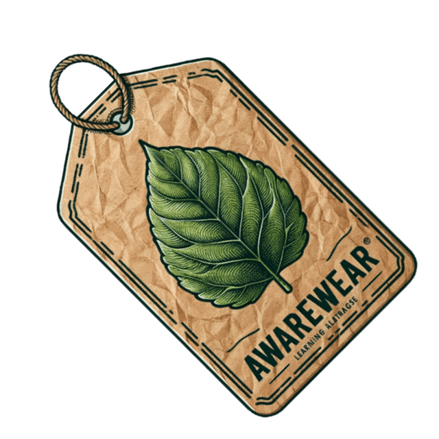
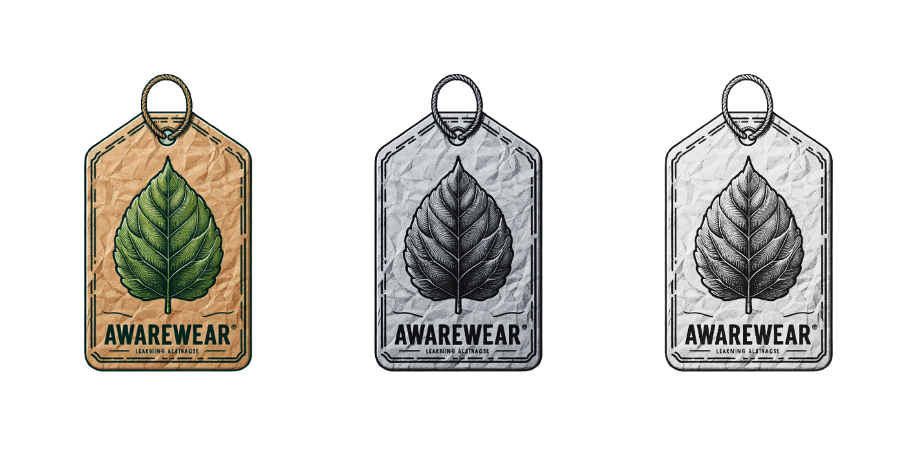
The AwareWear logo takes the shape of a clothing tag, with a vibrant green leaf cradled at its center, reflecting our commitment to the environment. It's set against a backdrop reminiscent of natural paper, enhancing its organic appeal. 'AwareWear' is written in bold letters, underscoring our focus on sustainable fashion education. A rustic border encases the logo, marrying structure with the essence of nature. The logo comes in three variants: full color on the left, displaying the leaf in its lush green; a grayscale version in the middle, for understated elegance; and a stark black and white version on the right, for classic simplicity. Each version represents our fusion of style, learning, and eco-awareness.
Badge Logos
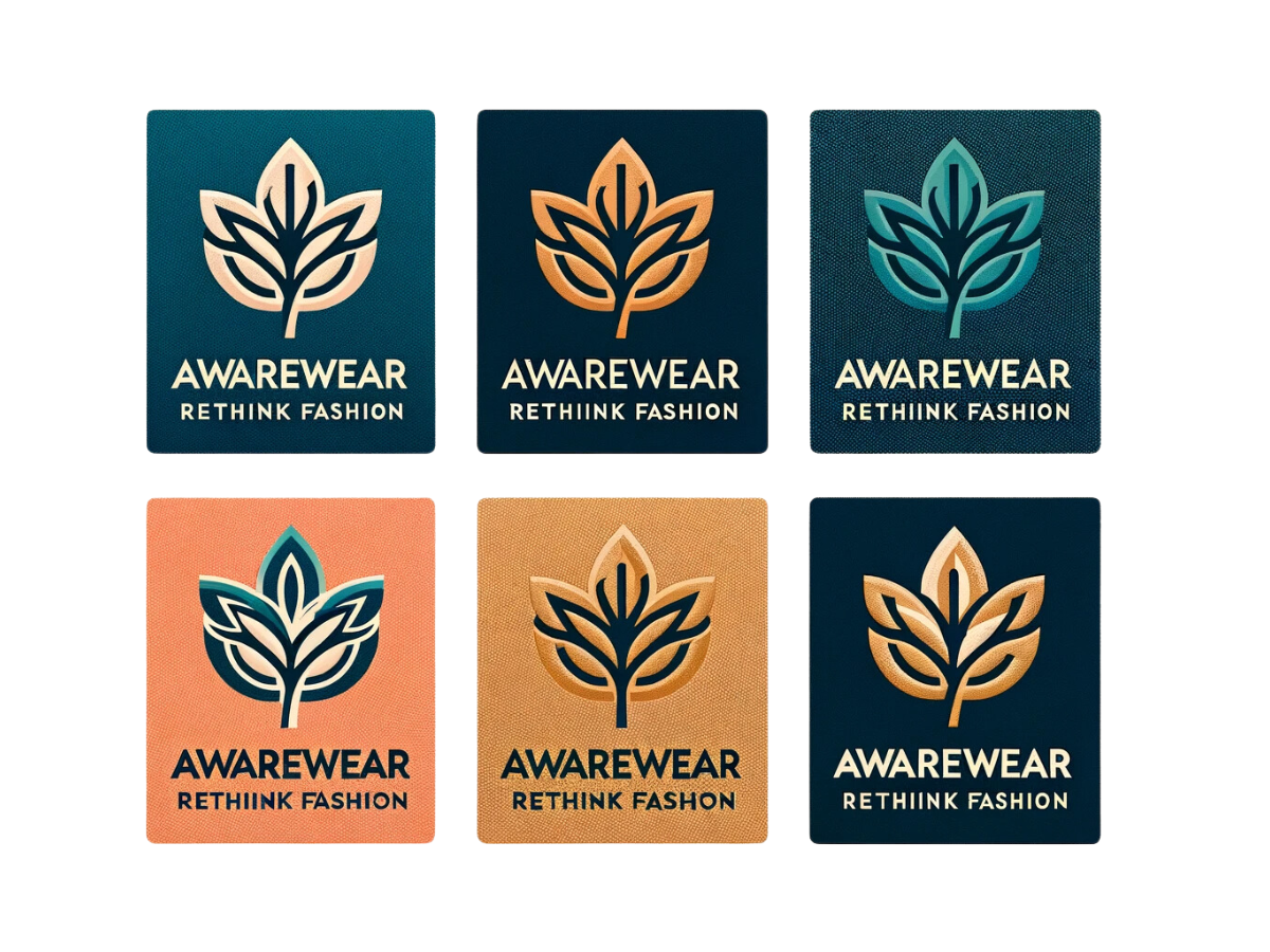
AwareWear features six badge logos, each splashed with one of our signature colors. The font was deliberately chosen due to how the letters W nests into the A. These badges aren't just pretty— they're a key part of our app's look and feel. More than that, they're on brand with sustainable fashion. They use our brands colours to fit seamlessly with our application. The leaf within the logo is representative of sustainability and the subtitle speaks to educating our users to rethink they're fashion decisions.
Logo Sizing
Badge Logos: Designed to be clear and legible at a standard size of 60 pixels tall to ensure visibility within the app's interfaces, suitable for high-resolution displays. Each badge displays one of the brand's six signature colors, optimized for quick recognition.
Hang Tag Main Logo: Presented at a standard size appropriate for mobile interfaces, generally above 60 pixels tall, to maintain visibility and brand presence, with an enlarged version featured prominently on the landing page. Available in three variations: full color, grayscale, and black and white, each designed to be distinct and legible across different devices.
Color and Clarity: Logos are created to be easily readable and visually appealing at a size that's standard for mobile displays, ensuring the branding is effective and consistent. Color variants of the logos are chosen to contrast well with various backgrounds, enhancing visibility and recognition.
Accessibility: The logos are designed with accessibility in mind, including alternative text for screen readers. A clear space guideline ensures logos stand out from other UI elements, with padding that's proportionate to the logo's size.
Colour Palette
Berkeley Blue
#003366
Light Red
#FF6B6B
Goldenrod
#DAA520
Keppel
#5DA399
Sea Salt
#FAFAFA
Davy's Gray
#4A4A4A
Berkeley Blue is utilized often to create a sense of cohesion.
Example: Main features throughout the app including buttons to start the quiz and unselected answers in the quiz.
Blue evokes feelings of trust, reliability, and calm, suggesting stability associated with knowledge and expertise. For an educational platform discussing the complexities of fast fashion, it creates trust, helping users process information stress-free.
Light Red accentuates features adding a touch of vibrancy.
Example: Pins on the map and the button leading to the educational pages.
Red elicits emotions of urgency, alertness, and energy, drawing attention to significant details. In a platform about fast fashion's impacts, this hue underscores the immediate need for sustainable choices, galvanizing users towards conscientious decisions.
Goldenrod highlights important elements, ensuring they capture the user's attention.
Examples: Button to start the quiz and selected answers in the quiz.
Goldenrod embodies optimism, warmth, and clarity. As a hue reminiscent of sunlight and gold, it signifies value and enlightenment. Within an educational setting, it emphasizes the positive outcomes of sustainable fashion, encouraging users to make enlightened choices.
Keppel signifies positive feedback, like a correct answer, offering a visual reward.
Example: Button to launch the resources page.
Keppel, a serene shade of green, represents nature, renewal, and vitality. It's an apt hue for sustainability topics, reminding users of the environment. On a platform about fashion ethics, it celebrates the benefits of eco-friendly choices, inspiring hope and action.
Sea Salt provides a consistent backdrop, either solid or under images, ensuring clarity.
Example: The background of the application.
Sea Salt, an off-white hue, suggests purity, simplicity, and neutrality. As a backdrop, it offers a canvas for other colors and content to shine. In the context of fashion sustainability, it symbolizes a clean slate, promoting fresh perspectives and sustainable practices.
Davy's Gray is versatile, gracing buttons, nav icons, and text, setting a neutral tone.
Example: Quiz result window and buttons in the resources that lead off the application to the resource link.
Davy's Gray exudes sophistication, neutrality, and balance. It's a versatile color that can ground other brighter hues, aiding in focus. In lessons on fast fashion drawbacks, it serves as a neutral base, allowing other content to take center stage for effective learning.
Typography
Type Scale
We follow a 6px baseline grid for achieving a vertical rhythm on all block-level elements in the app.
Heading One 44px / 48px
Heading Two 36px / 45px
Heading Three 28px / 35px
Heading Four 20px / 25px
Font Style
Sans Serif | Lexend Deca
Lexend Deca Light
abcdefghijklmnopqrstuvwxyz
ABCDEFGHIJKLMNOPQRSTUVWXYZ
Lexend Deca Regular
abcdefghijklmnopqrstuvwxyz
ABCDEFGHIJKLMNOPQRSTUVWXYZ
Lexend Deca Medium
abcdefghijklmnopqrstuvwxyz
ABCDEFGHIJKLMNOPQRSTUVWXYZ
Lexend Deca Semibold
abcdefghijklmnopqrstuvwxyz
ABCDEFGHIJKLMNOPQRSTUVWXYZ
Serif | Queens
Queens Medium
abcdefghijklmnopqrstuvwxyz
ABCDEFGHIJKLMNOPQRSTUVWXYZ
Queens Bold
abcdefghijklmnopqrstuvwxyz
ABCDEFGHIJKLMNOPQRSTUVWXYZ
Queens Extra Bold
abcdefghijklmnopqrstuvwxyz
ABCDEFGHIJKLMNOPQRSTUVWXYZ
Grid Layout
Mobile Screen
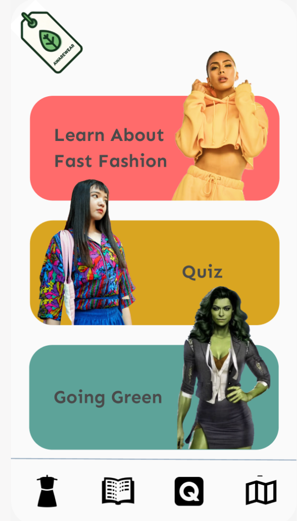
Main Navigational Page
Displayed on left
Grid Container: The main screen will compose of 3 block elements that will act as buttons leading users to our 3 main features:
1. Educational resources such as comprehensive articles and infographics detailing the impacts of the fast fashion industry on the environment, including water usage, carbon emissions, and labor practices.
2. An interactive quiz designed to evaluate a user's knowledge of fashion sustainability, featuring questions on ethical sourcing, environmental impact, and best practices for clothing longevity and care.
3. A curated list of textile sustainability resources, including a map of local eco-friendly stores, recycling depots, and upcycling workshops, encouraging users to participate in sustainable fashion consumption and disposal.
Graphics & Iconography
Iconography
Icons will be used to provide users with visual cues to facilitate navigation and improve the overall user experience. We have 4 main icons that will be used for navigation on the bottom of the mobile screen.Our icons our in svg format and found on www.fontawesome.com
Home
This button will navigate users to the home page where the can also access the educational resource, sustainable aptitude quiz, and textile recycling resource pages.
An icon of a home describes a home page.
Educational Resources
Here the user can navigate to our educational resources. This will be a series of pages with facts about the fast fashion industry and how to make more educated decisions when purchasing.
This icon is a book and that represents educational resources and learning.
Aptitude Quiz
This icon will be the link to our quiz. This is where people will test their knowledge to see how much or little they know about fast fashion and textile sustainability.
The question mark represents the unknown which is why it leads users to our quiz.
Map & Resources
This icon will lead users to our fashion sustainability resources. There will be a map feature where users will be able to navigate to textile recycling depots, thrift stores and other resources.
This icon is a map and represents the map feature.
Image Guidelines
Main Navigational Page
On our main navigation page, the use of imagery is both strategic and symbolic. We feature waist-up portraits of women, each carefully selected to represent the demographic focus of the corresponding navigational link. These images are presented without backgrounds for a seamless integration over our interactive buttons. Their size exceeds that of the buttons to allow for a tasteful overflow onto the page, with the images' bottom edges aligning precisely with the button's lower margin.
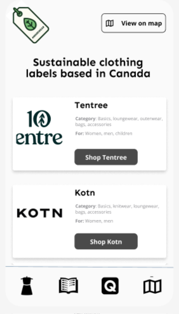
Resource Page
In the resources section, we complement business listings with representative images. These will not only serve as visual identifiers but also as engagement tools, inviting users to learn more about each enterprise. The images used here, like those on the navigation page, will be crisp and clear to foster immediate connection and recognition.
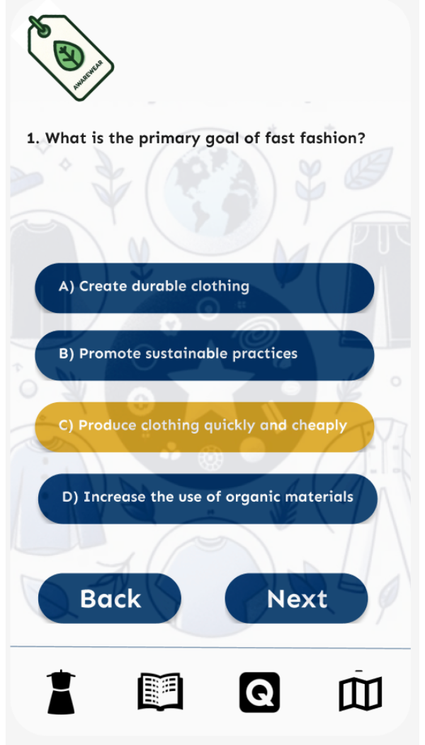
Quiz Page
The quiz sections of our application will utilize images that are proportionally larger, taking up either a third or a quarter of the viewport. The purpose of these images is to effectively convey various emotions and states of being, resonating with the user's journey through the quiz. This deliberate sizing ensures that expressions and sentiments are easily discernible, enhancing the interactive experience.
Buttons
| States | Primary Buttons | Tertiary Buttons | Secondary Buttons |
|---|---|---|---|
| Active | |||
| Hover | |||
| Disabled |
1. Primary buttons, featuring a prominent design and bold colors aligned with our brand, will be strategically placed to facilitate the most common actions, such as launching core features of the application like the personal sustainability tracker or the virtual wardrobe.
2. Secondary buttons, designed with a subtler appearance, will be used to provide users with quick access to a wealth of resources such as in-depth guides on sustainable fashion practices and external educational materials.
3. Tertiary buttons, with a more discreet design, will be employed for navigation within the application's interactive quiz section, guiding users through questions and leading them towards a more informed understanding of their fashion footprint.